How Graphics Can Improve Your Photo's Message
The photo I am working on today is a poor quality photo that I took with my phone while working on a project. The lighting conditions were poor and the composition wasn't much better. I initially published a tutorial using the original poor quality photo. The photo was an important part of the tutorial I prepared which demonstrated the technique I used for painting a laminated dresser. The number of page views increased dramatically after I republished my tutorial with changes to the photo.
Usually a few simple adjustments to the exposure will usually help improve a photo, but nothing seemed to help with this one. So to keep the photo but improve the message, I added text and graphics. Although the quality of the photo itself doesn't improve, the graphics save the day by giving the viewer sufficient information about the subject at a glance. (You can use any photo editing software, but for this photo I used PicMonkey.)
LET'S TAKE A LOOK AT HOW MY DESIGN EVOLVED:
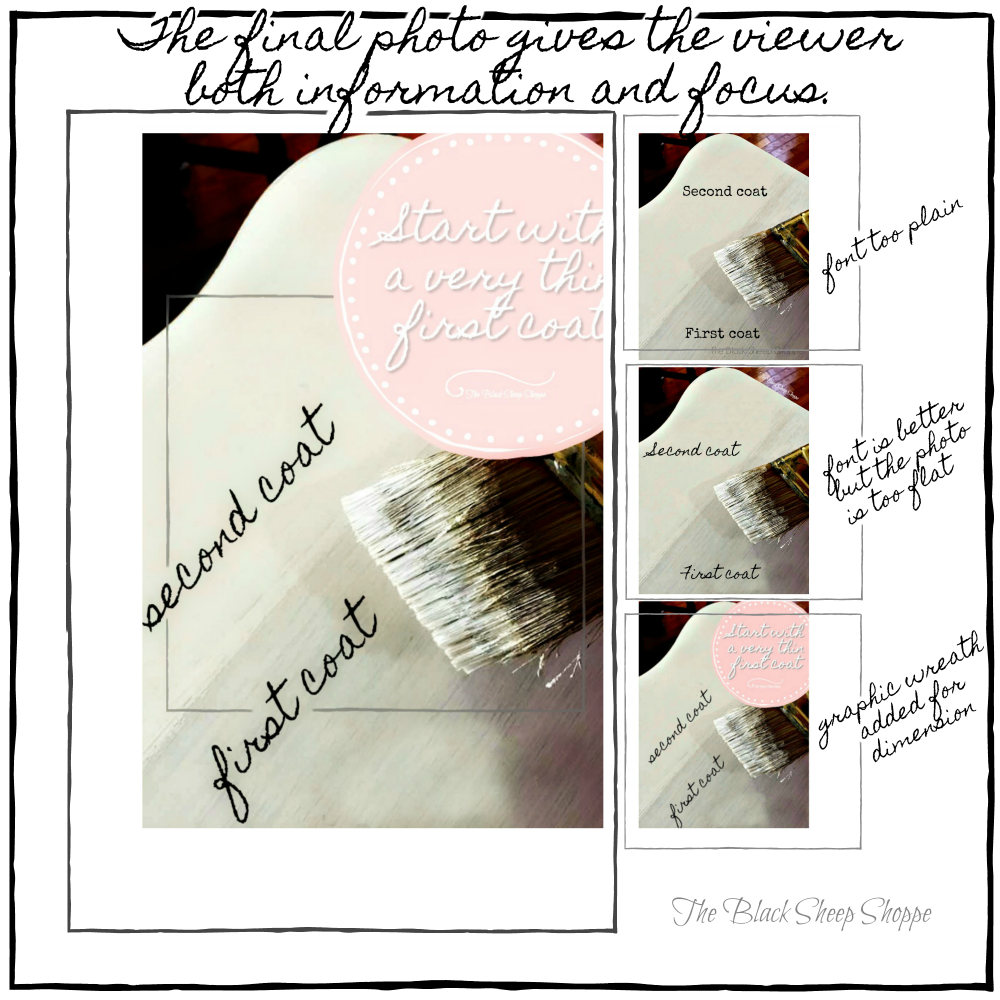
The subject of the photo is the importance of using a very thin first coat of paint. With the paintbrush in the foreground the subject is obviously about painting, but without further information the message itself isn't 100% clear.The initial text I added helps the viewer see at a glance that the photo is not only about painting, but showing the difference between the first and second coats of paint. The font is easy to read, but I felt it was too plain and didn't add visual interest to the photo.
So next I changed the font to script. The script is not as easy to read as the previous font, but it adds a little more fluidity and movement to the photo. But it still needs something more to provide more information about the subject.
Next I rotated the text to follow the paint lines. Then I added a pink graphic wreath with additional text to the upper right corner of the photo.
The color choice of the graphic plays an important role and also impacts the final design:
Ultimately I chose pink because it coordinated with the staging that I used in my finished project of the tutorial:
The final step was to add a small frame to focus more closely on the area of the photo that shows the difference between the first and second coats.

I hope you found the information provided today helpful. Thanks for stopping by The Black Sheep Shoppe.


Comments
Post a Comment
Select the NOTIFY ME box to receive a notification of a reply to your comment (yes, I do try to acknowledge all comments). There might be a publishing delay on older posts as they are moderated to reduce spam.