Conquer the Mirror Reflection!
Mirror Photography Without Expensive Photo Editing Software
You don't need expensive software to edit the reflection out of a mirror. Today I am sharing a couple of tricks to show you how an amatuer such as myself can get the best shot without spending a lot of money. Sure photo editing is a solution, but it can be expensive, and there is a definite learning curve to creating a background that doesn't look too doctored. If you want to sell your furniture, then getting a scroll stopping photo can DEFINITELY get you more money and a faster sale!
But first let's take a look at a what-not-to-do example . . .
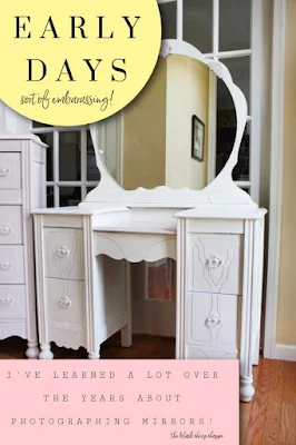
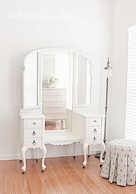
This is a photo of a vanity I did years ago. It isn't the worst photo ever, but I think you'll see how my skills progressed, and by making a few adjustments I was finally able to master the mirror reflection.
This photo is typical of what you might see on Facebook Marketplace. The background behind the vanity is too busy and distracts from the focal point. The reflection captured in the mirror is jarring and doesn't do justice to the furniture.
TRICK #1 FOR MIRROR REFLECTION:
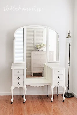
Fast forward a couple of years and you'll see an improvement in the layout. I placed this vanity in another room so it would reflect an unobtrusive background. But I had to stay far to the side to avoid catching not only a busy background, but my reflection as well.
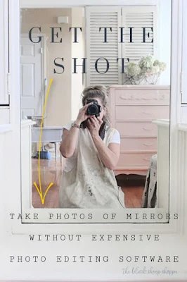
The photo below is a straight shot of the vanity's mirror.
- I am front and center in my painter's smock.
- On the right of the photo you will see the props I used to create a background for the mirror's reflection.
- On the left side of the photo you'll see an assortment of items, including a broom, but don't worry it won't show in the final photo!
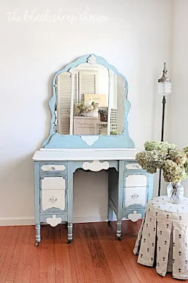
I am still standing to the side of the vanity, but I was able to greatly reduce the angle, so now the potential buyers can see the full vanity in all her glory. For the reflected background, I created a layered effect of props with a pair of louvered doors that I scored for a couple of bucks from Habitat Restore, a thrift store dresser painted pretty in pink, and a few floral hydrangea stems cut from my yard.
I took it one step further and added a vanity stool to the foreground. Not only does the upholstery add a touch of softness to the photo, but more importantly it also provides a sense of scale.
SAME TRICK DIFFERENT EXAMPLE:
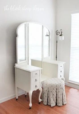
Same trick but with a different vanity. Once again you can see I positioned myself to the side and the mirror is reflecting a window in the background.
Vignette #1: Next, I played around with a couple of simple props in the foreground to balance out the photo. Don't be afraid to play around with the placement of your props. This vignette made the photo feel unbalanced, so I made some slight adjustments.
Vignette #2: The vanity stool in the foreground adds depth of field to the photo, but I found it slightly distracting.
Vignette #3: I moved the stool in front of the vanity and placed the floral arrangement on top. The floral arrangement was too tall and was a distraction. The vanity stool covered up too much of the vanity.
Vignette #4: I moved the two props to the side and it felt right to me, so this was my lead photo when I advertised it for sale. It sold for asking price within a couple of days.
Here's a quick visual summary of how to photograph the mirror reflection and stage both the background and foreground for the best photo possible.
TRICK #2 FOR CONQUERING THE MIRROR REFLECTION:
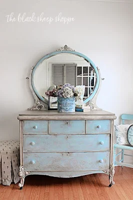
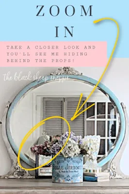
Most likely you don't notice me at first, but if you look closely you will see me hiding behind the props.
I am leaning over as best I can to hide behind the props. My white shirt blends in with the wall, and my jacket mostly blends in with the louvered doors. The simple solution here would be to use a tripod but mine wasn't handy, and again, I was pressed for time.
I planned to use only the pot of hydrangeas to hide behind, but my shoulders and upper body were showing in the reflection.
- I added a small framed print behind and to the side of the florals to hide my body. A slightly larger frame would have been even better.
- A crystal lamp and a small stack of books to the other side of the florals to balance out the vignette.
- My louvered doors are propped up in the background to partially block the reflection of the french doors behind me.
Could I have done better? Absolutely! It's a learning process:
- In hindsight, a larger frame would have provided more opportunity to hide behind.
- Alternatively, I could have raised the frame on a stack of books.
- A tripod would have simplified the process, too.
But I was limited on time and needed to get the furniture moved and sold. So I made the best of the situation and went for it! And the best news was it sold in record time!
 |
| Create a background for the mirror reflection. |







Comments
Post a Comment
Select the NOTIFY ME box to receive a notification of a reply to your comment (yes, I do try to acknowledge all comments). There might be a publishing delay on older posts as they are moderated to reduce spam.