Photography to Sell Furniture
The best part of painting furniture as a business is painting furniture. However, the crucial step for success is actually selling the furniture. But unless customers are lining up outside your door, the hard work will be getting the word out that you have a fabulous piece for sale! My photography has evolved and improved over the years. Seriously some of my old photos make me cringe! But I have found that better photographs have resulted in quicker sales. Today I will share a few tips of what I have learned.
ESSENTIALS FOR CREATING A GREAT PHOTOGRAPH:
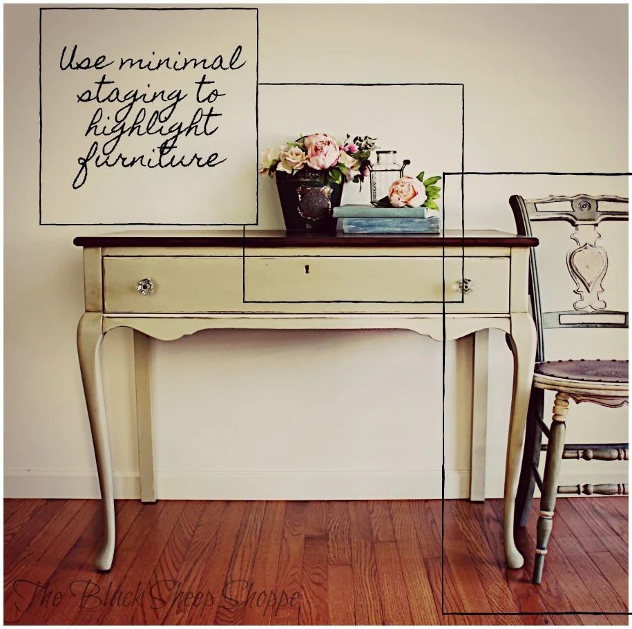
Let's review some of the essentials for creating a great photograph for furniture sales. First you will want to clear an area to place your furniture piece. A plain background works best to avoid distractions from the star of the show. I typically will take my photos indoors, but outdoor photos can be useful as long as the background is either beautiful or uncluttered.Finding the right balance of staging items is key to evoking an emotional response from the customer. Nevertheless, the goal should be to dress up the furniture without distracting from it. The staging items I use in my photos are simply items that I either "shop" from my home or items I curate to sell in my booth.
In this example I used five main pieces for the staging: two books, a metal container, a glass jar, and flowers. The chair to the right of the desk is not essential, but in addition to balancing and anchoring the photograph, it also helps the customer know that this is a desk and not a table.
Instead of lining up everything in a row, layer and group the staging items to add visual interest. For instance, the metal container with flowers is flat against the wall. The glass jar needed some height, so I placed it on top of the books (which are actually a couple of my cookbooks that I painted the jackets to use for staging). The books are in front of the container and slightly angled. The single flower on top of the books balances out the vignette.
Be sure to take photos from a variety of angles to help the customer envision the dimensional aspects of the piece.
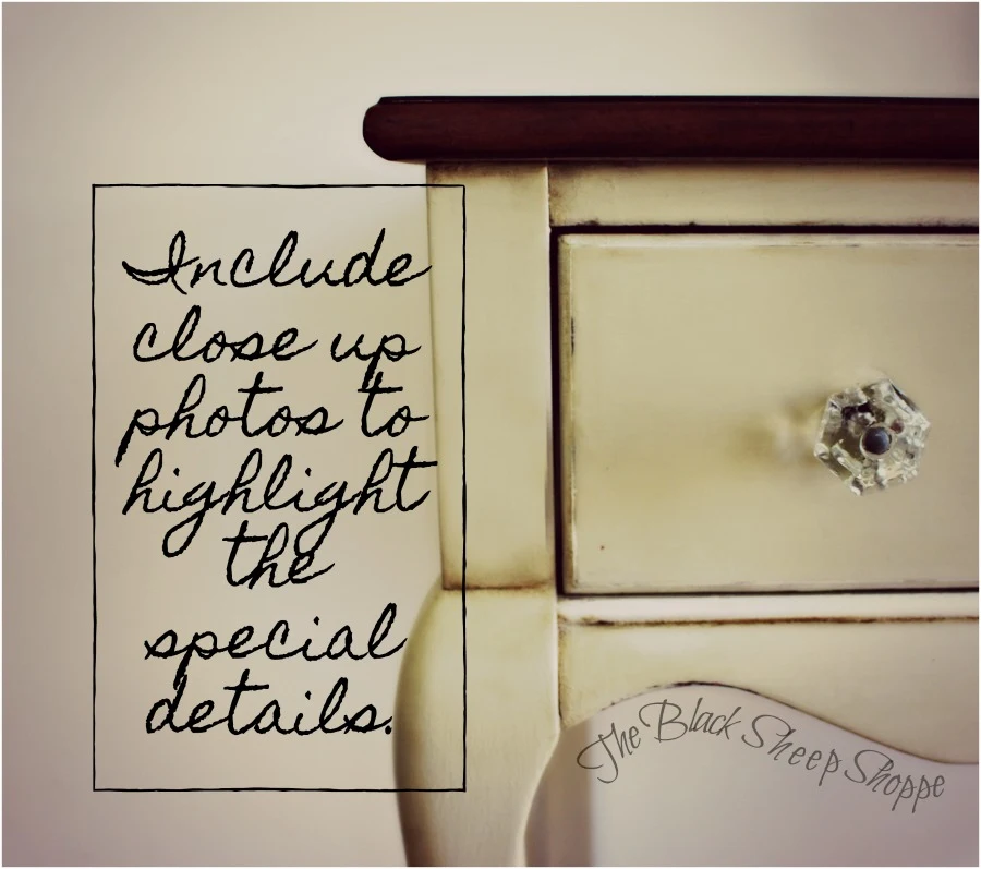
Lastly, include close up photos to highlight the special details of the furniture. In this photo I wanted to be sure to highlight the beautiful glass knobs.
This is the final lead photo that I used to advertise the desk for sale. The staging helps brighten the photo without distracting from the main piece itself. I typically take many photos of my furniture piece using different light settings and angels. Then I select only the best shots to use for my advertising photos. Typically I limit my advertising photos to three to five shots: front, side view(s), and a couple of detail shots. This number seems to be enough to share the essentials without being overwhelming to the viewer.
Although photo effects can be useful for social media purposes, I do not use any photo effects in my advertising photos.
I hope you found the photography tips useful. Thank you so much for stopping by The Black Sheep Shoppe.
The example I used in this article is an antique desk that was painted in Versailles (Chalk Paint by Annie Sloan). The top of the desk has a dark stained finish.


Comments
Post a Comment
Select the NOTIFY ME box to receive a notification of a reply to your comment (yes, I do try to acknowledge all comments). There might be a publishing delay on older posts as they are moderated to reduce spam.