Sell Your Painted Furniture. Part 2: Staging
Today I will share with you some tips for creating a vignette and staging your furniture to sell. We've all heard that a staged home on the market helps with sales. The same holds true for selling your painted furniture! If you paint furniture to sell but struggle with staging, then this article is for you! I've include lots and lots of examples, so bookmark this page for future!
STAGING YOUR PAINTED FURNITURE:
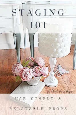
Create a vignette. Keep the items simple and relatable to the piece of furniture. For instance, if you're selling a dresser don't stage it with your china set. Instead use some florals, a lamp that is in scale with the furniture, a stack of books, or a picture frame. The book I used in the photo below didn't coordinate with the furniture, so I wrapped it in brown paper to keep it neutral.
Think about how your potential buyer might decorate the piece. Better yet, show them how to decorate it! Most of my staging items have sold, too!
FLORALS
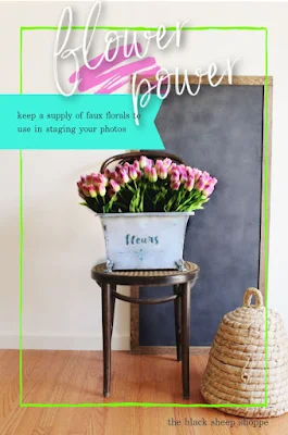
I don't invest a lot of money in my staging props, but I did make a small investment in some floral arrangements which you will see used many times, over and over, throughout my blog. I am including links to some of the florals that I actually purchased which typically work well with a variety of furniture staging (these are affiliate links to items I purchased). The varieties available are endless and there are many color options! Choose one or two (or more!) that work with the style of furniture you sell. BONUS: The flowers can do double duty and be used as decor items in your home for your personal enjoyment as well.
I typically use florals in my vignettes, but in this case I was selling a vintage shoe shine box. So I used shoes and shoe polish to help tell the story.
STAGING PROPS:
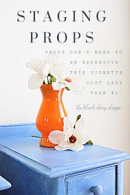
The good news is you don't need to spend a lot of money on props for staging. I wanted my props to have a splash of color for this set of nightstands. I didn't have anything suitable on hand, so I made a quick trip to a local thrift store, and a couple of bucks later I had what I was looking for.
LESS IS MORE:
The vignette you create should help set the tone or tell a story, but it shouldn't be the star of the show. Remember less is more. Don't be afraid to add and take away items from your initial vignette until you get it just right. Below is an extreme example of way too many props. No I didn't stage it this way to sell. Instead this was a photo I took of some of the small items I was taking to my booth. But I think it makes my point all the same.
The props you use should compliment the style of your furniture. Farmhouse and industrial style is all the rage, but it will look out of place with a delicate style piece of furniture.
COLOR:
Keep color in mind when choosing items to style your vignette. Your props should compliment or coordinate with the color of your furniture. I think both the options in the photo below look good, but the purple lavender works best in my opinion.
VISUAL SCALE:
Scale is also important. For instance a large lamp on a small nightstand will look out of place and distort the balance of the photo. I like the size of the floral arrangement in the first photo below, but the color didn't pop enough. So I switched to the purple lavendar floral arrangement and raised it to the top shelf for extra height.
Additionally, adding an item that is common to most people will help provide a visual scale of the size of your furniture. Many times I will add a chair to the photo to help provide visual scale for the buyer. If the chair is not for sale then I place it off to the side and partially cut out of the photo. If the full chair is showing be sure to mention in your ad that it is not included, or if it is for sale, then simply mention it is available for an additional price.
In fact you will see a chair frequently in my photos. Here it is again as another example of how it can help the buyer visually imagine the scale of the furniture.
CREATE SPACE:
Give your furniture breathing space. A cramped photo won't do your furniture justice. Step back slightly and give it a little space.
As you play around with the space, also keep in mind the angle you are shooting. If you're too high or too low it will distort the photo. Usually I allow the very bottom of my staging items to show on a dresser. I will show a just a tad little more of the top if I am taking a photo of a smaller side table. The difference in the photos below are very subtle, but if you look closely you will see how I adjusted the angle.
Here's another example of capturing the best photo using the correct angle.
- In the first photo the bottom of my staging props are cut off and you can see the underneath portion of the table.
- The second photo is "eye level" as I was standing up while I took the photo. It shows too much of the table top and distorts the propotions.
- The third photo is the best. The angle is slightly above the table allowing the bottom of the staging props to show.
RULE OF THREE, TRIANGLES & A POP OF COLOR:
I don't follow this all the time (do as I say, not as I do!), but whenever I'm stuck I always fall back on this trick. It helps me focus my staging and works everytime:
- Use three main neutral items in your staging vignette,
- set up the items in a triangular arrangement,
- include a pop of color.
For my three items in this example I used a lamp, a simple floral arrangement, and a sign. (I didn't have anything on hand that worked for my third item, so I quickly made the sign out of scrap wood. The sign later sold, too!)
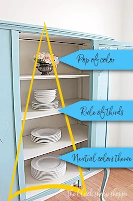
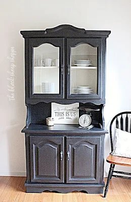
Here's another example of staging a china cabinet using the rule of thirds, the triangle, and a pop of color.
Try out a few different vignettes until you find one that works best.
FURNITURE WITH A VIEW:
Finally, once you've created the perfect vignette for your furniture, be sure to include, at a minimum, the following photos: a front view, side view, and close ups of the details.










Comments
Post a Comment
Select the NOTIFY ME box to receive a notification of a reply to your comment (yes, I do try to acknowledge all comments). There might be a publishing delay on older posts as they are moderated to reduce spam.